Sorting your Alarm devices
Project: Ring Alarm--Device Sorting
My role: UX Design / UX Research / Prototyping
Who I worked with: A full-stack team made up of Product, Development, and QA professionals
Background:
A DIY home security system, Ring Alarm launched in July 2018, bundled with several devices such as a keypad, door/window sensors and a motion sensor. More products were added to the Alarm ecosystem over the following year, resulting in a laundry list of security devices to keep track of in the Ring mobile app.

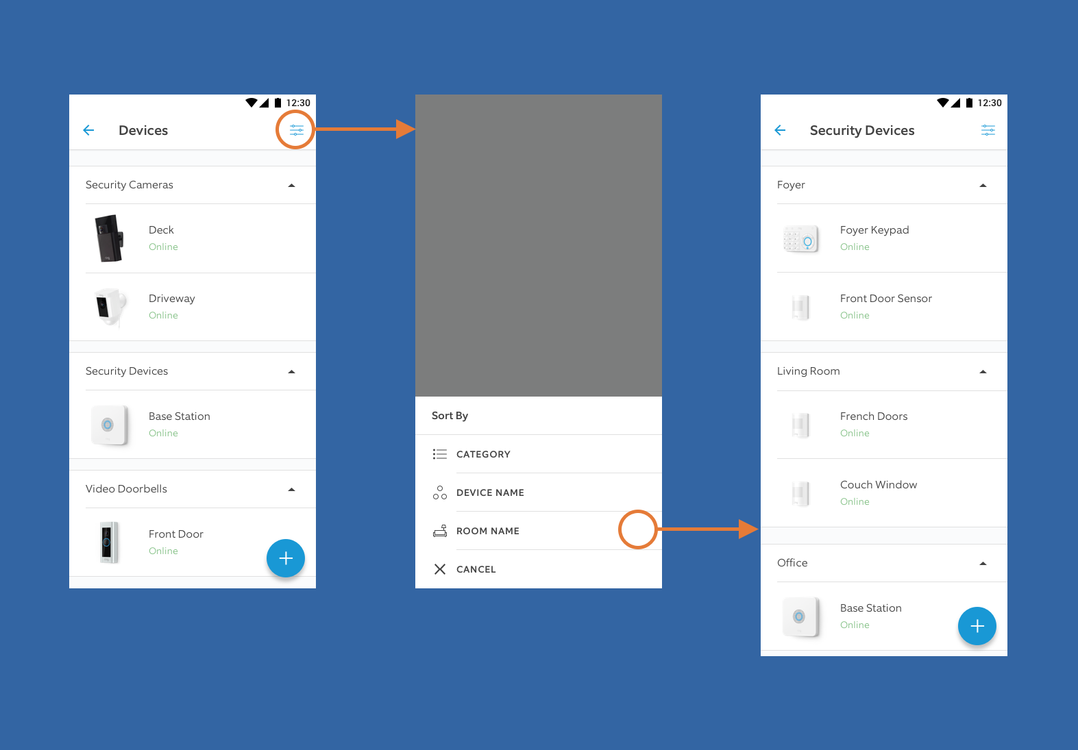
Sorting Alarm devices by the room they're in
The problem:
In the initial app release, Alarm owners couldn't sort their security devices to see them all in one section. This pain point became apparent in support calls and in Alarm user groups on social media.

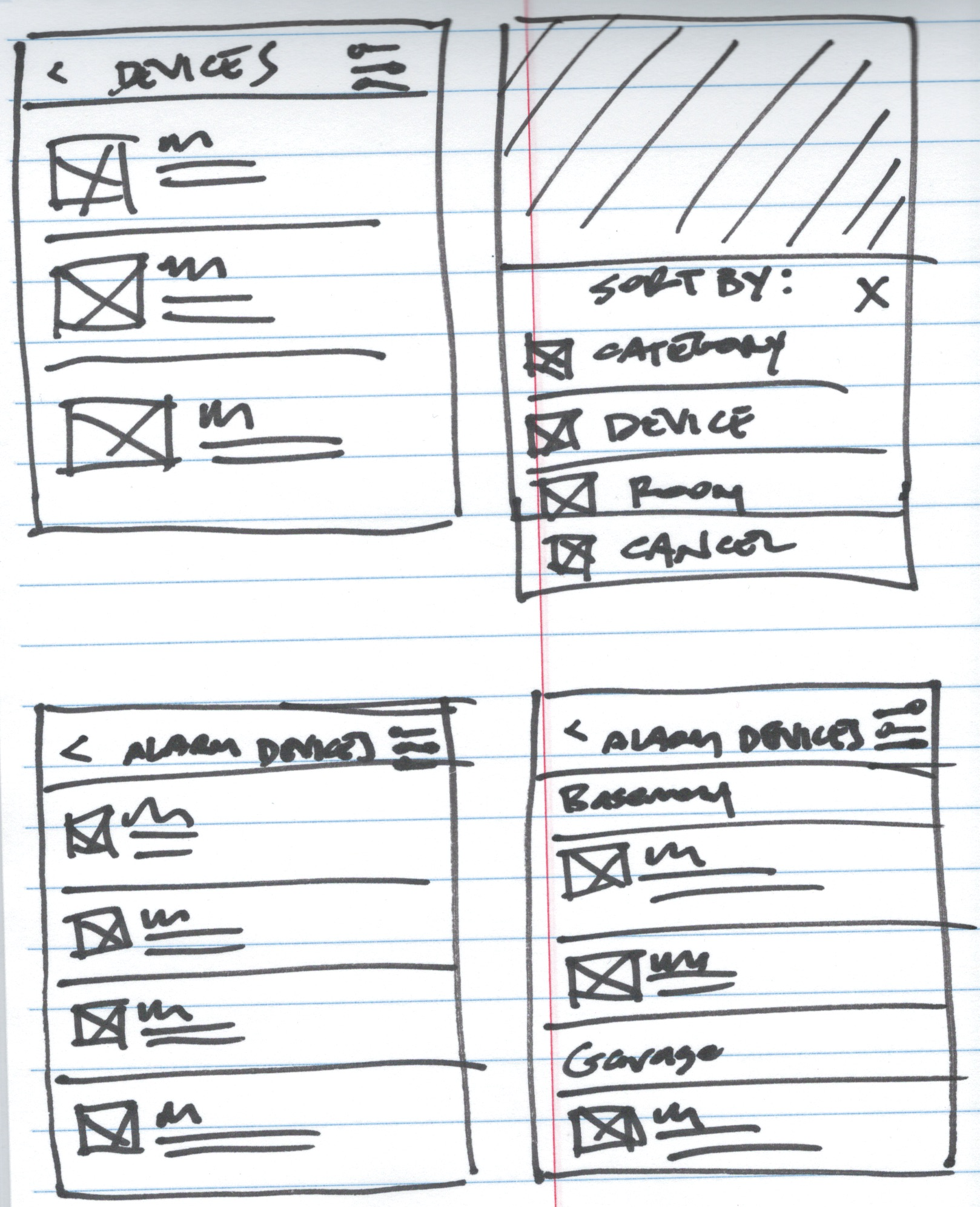
Sketching out some screens
Starting the process:
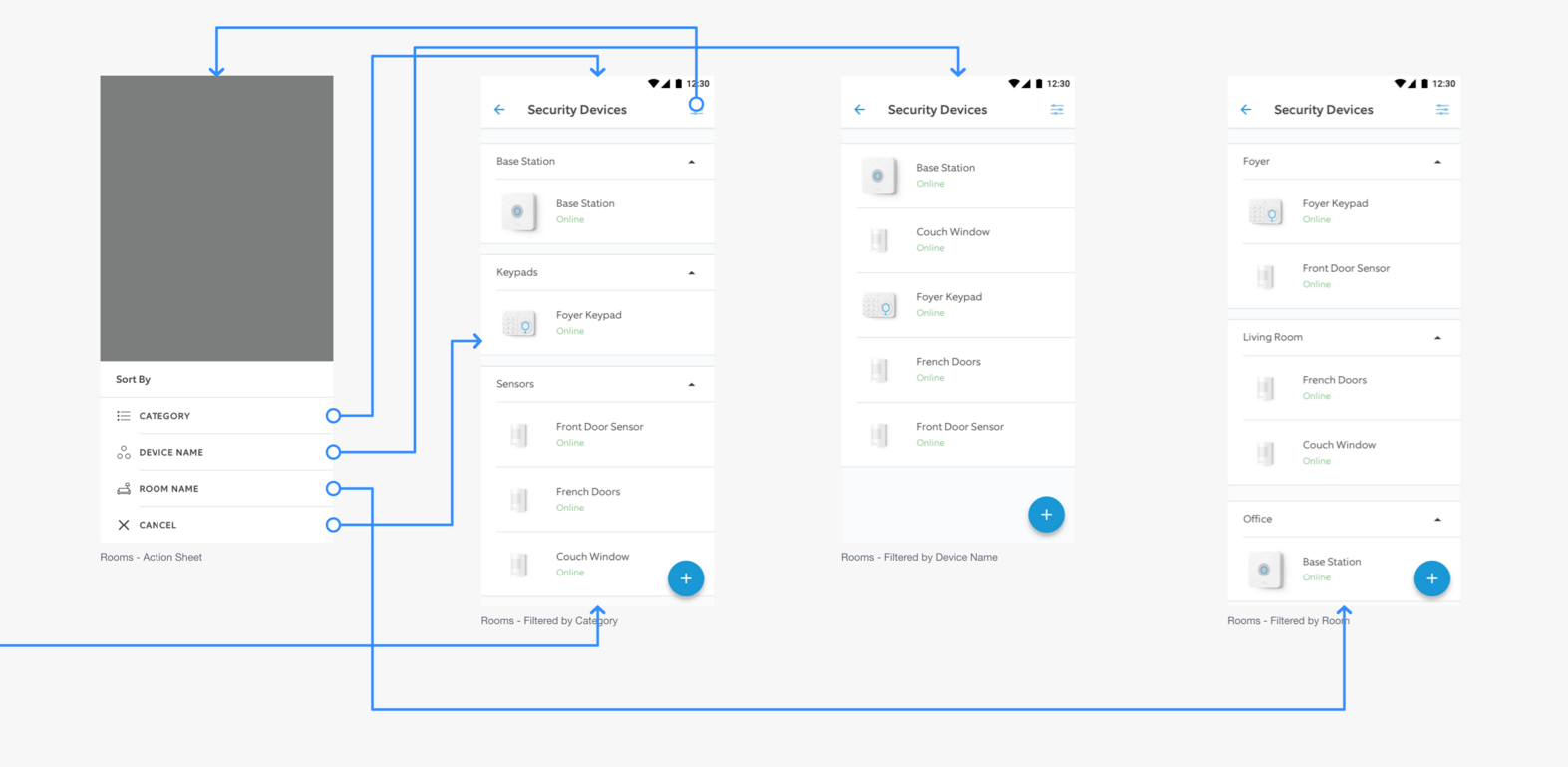
After meeting with my team's product manager and engineers, we indentified the three ways each security device was classified on the backend: by category, room, or device type. We agreed this made the most sense for a new sorting feature.

Flowchart detail showing sorting security devices
Getting into it:
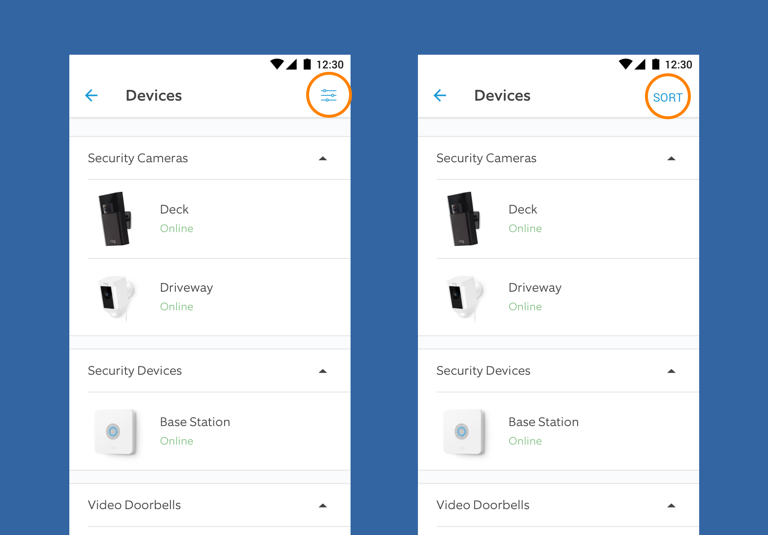
For starters, I decided to mock up two prototypes for A/B testing with InVision, one with a familiar "filter" icon and one with the word "Sort." I wanted to see which version, if any, participants preferred. To reduce bias, I tested with newer employees who were unfamiliar with the Ring app, as well as non-technical employees. For this test I recruited 8 participants.

Detail of "filter" icon versus "Sort" text button
Learnings:
Prototype A contained the "filter" icon and Prototype B used a text label with "Sort" instead. Five out of eight participants preferred Prototype B. When asked why they chose Prototype B, several testers said although they understood the icon, for them the word "Sort" was immediately clear to them.
After presenting these results to the team, my recommendation was the button with "Sort" on it. There was pushback on this suggestion. Ring Alarm was being prepared for launch in other countries including the UK and Germany. Localization was a concern for the team. For example, the German word for "Sort" is "Sortieren." Implementing this label would cause the text to wrap around or get clipped, making the button confusing and unusable.
Conclusion:
Although the results were nearly split in the A/B testing, we decided to move forward with the filter icon versus the text button. Many app users are familiar with the filter icon and since this was a non-destructive action, we felt that non-tech users would learn what the filter icon meant over time.
Our team successfully delivered this feature in four weeks and helped reduce support calls over the next 6 months by ~1.5 %, making a difference for nearly 1M Ring Alarm users when sorting their security devices.
