Improving the installation experience
Project: Ring Alarm -- Contact Sensor installation improvement
My role: UX Design / UX Research / Illustration / Prototyping
Who I worked with: A full-stack team made up of Product, Development and QA professionals
Background:
Ring’s mission is to help make neighborhoods safer by offering a suite of products ranging from video doorbells to the Ring Alarm, a DIY home security system.
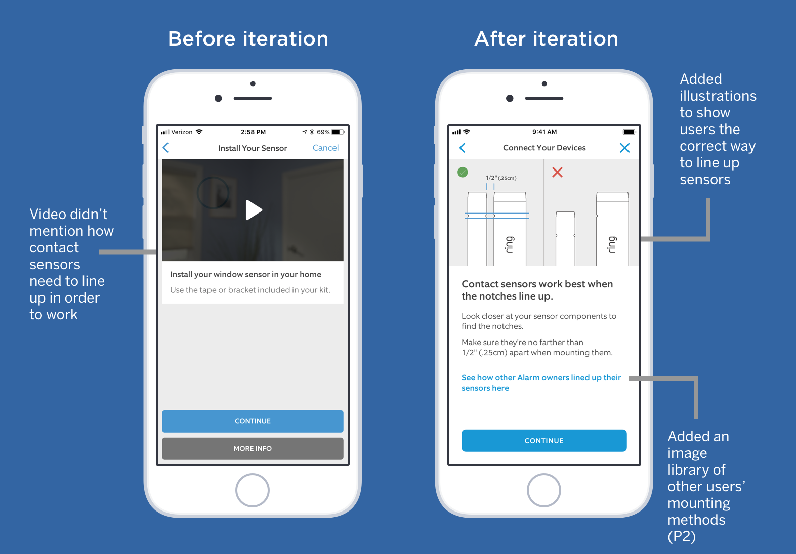
Before and after views of the contact sensor install flow
The problem:
The Ring Alarm customer support center was experiencing high call volumes after its release and a significant number of calls were about contact sensor placement.
Used for doors and windows, these sensors have physical markings on them that must be lined up before positioning and affixing to doors and windows.
The contact sensor installation flow in the initial release of the Ring app consisted of just a few screens and a generic video. There was no mention made that these sensor pieces needed to be aligned in order to work properly.
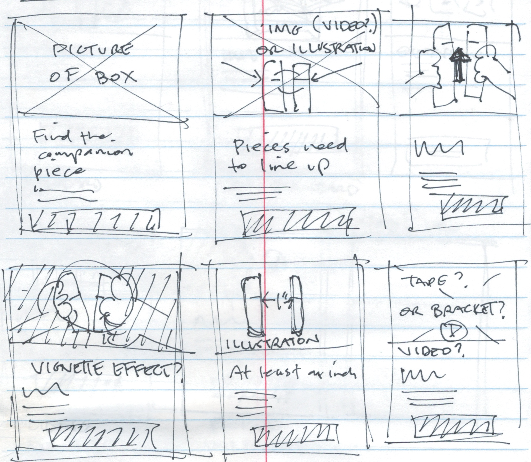
Sketches for additional installation screens
Initial steps:
To get a better understanding of our customers' pain points, I read through numerous transcripts of support calls involving contact sensor placement. Callers were frustrated and needed more information.
After whiteboarding with my team's product manager and developers, we decided to add several screens to the flow, which included "tips" on aligning, placing and installing the contact sensors. The goal for this improvement was to be more informational and help reduce support call volume, without extensive development time.
We also decided to split the flow into 2 branches: one for window sensors and one for door sensors. Both flows would use many of the same screens to minimize development time. Our timeline was short for this improvement: 4 weeks.
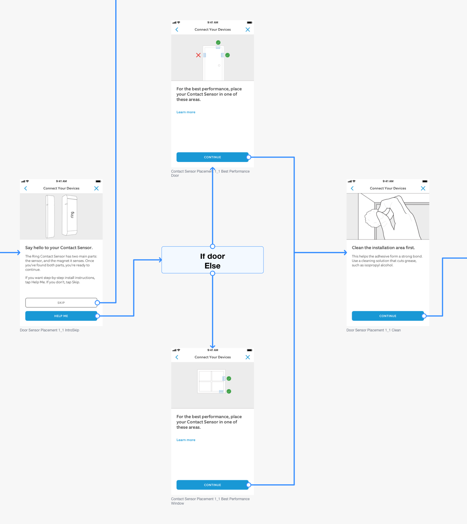
Flowchart detail showing branching for door or window install
Getting down to work:
After quickly mocking up the new installation flows, I presented these to the team for additional feedback. With a few iterations, the team agreed on an approach and we got started.
Working in parallel with the developers, I was sourcing illustrations for the new flow, creating new illustrations, and usability testing. Using InVision, I put a prototype together and tested with internal employees because of the short timeline. In order to reduce bias, I recruited employees who were in non-technical roles such as marketing and office management.
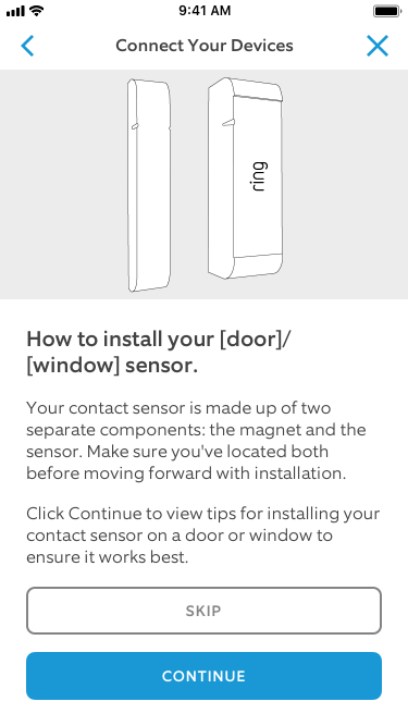
Detail of initial screen with "Skip" button
Learnings:
One of the biggest takeaways after usability testing was the use case for someone installing large quantities of sensors. The door/window flows each consisted of 7 screens filled with tips on placement and alignment.
Customers with large homes could very well be installing lots of sensors and would have to go through these 7 screen flows for every sensor they added. In order to reduce fatigue, we decided to add a "Skip" button to the initial "tips" flow (see above).
By doing this, multiple sensor users could get through the install process quicker without having to view the "tips" flow over and over. If users tapped on the "Skip" button, they were taken to the final install screens in the flow.
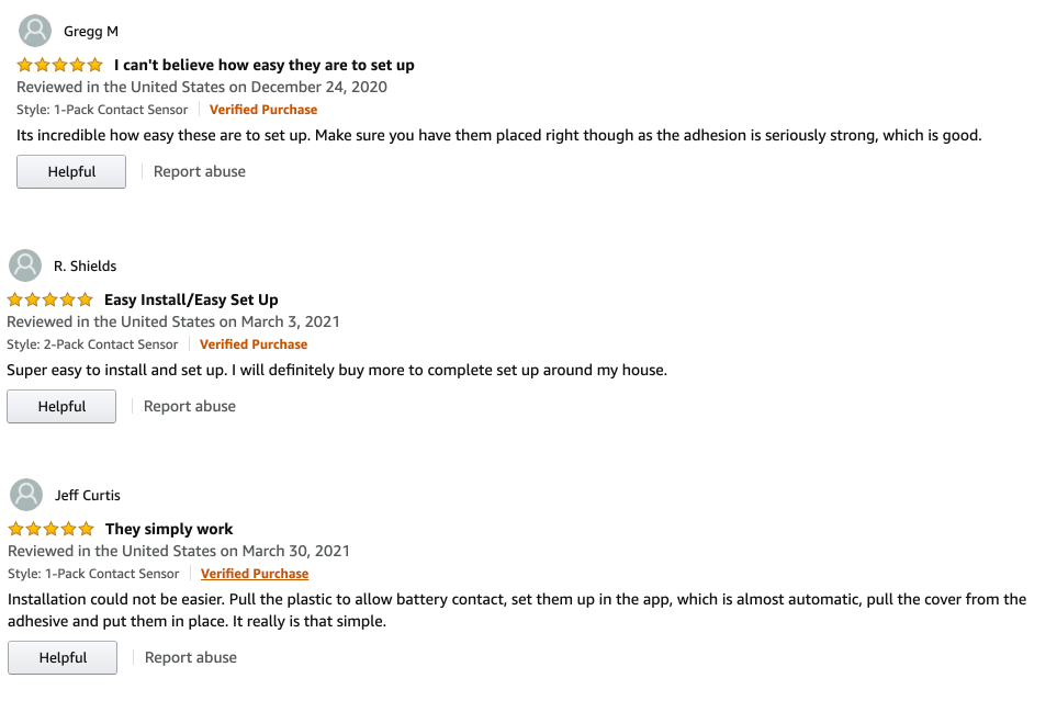
Amazon reviews on the contact sensor installation after this updated flow was released
Conclusion:
Our team delivered this expanded flow on time and as a result, we were able to reduce support call volume by ~3% over the next 4-5 months. Considering there are nearly 1M Ring Alarm users, this made an impact. The added screens helped users understand more about their contact sensors and how to get the most out of them.
